
On The Beach
"I want to go to the Gulf Coast to document the catastrophic oil spill currently happening in the Gulf of Mexico. My interest is in documenting where people are waiting for landfall, as well as documenting places where the oil has made landfall already. The finished project will be a small self-published book of approximately 30 photographs.
Money will be used for flying down there, for places to stay, for renting a car and getting from place to place, for external hard drives to hold the photos made down there, for food, for research, and if there's any money left, for publishing. The more money I get, the more that will go into the project. The more $ that comes in, the more ground I can cover and the longer I can stay...and that will mean a stronger group of photos, and a better publication!
I’m going to focus on those waiting for landfall in Alabama and Florida. However, I also want to photograph the barrier islands in Louisiana that have been devastated by the spill if it’s possible to raise enough money to get over there. I foresee the majority of the work being about the waiting and the anxiety".
-Zoe Strauss
On The Beach Project Site


 2.
2.

 1.
1.
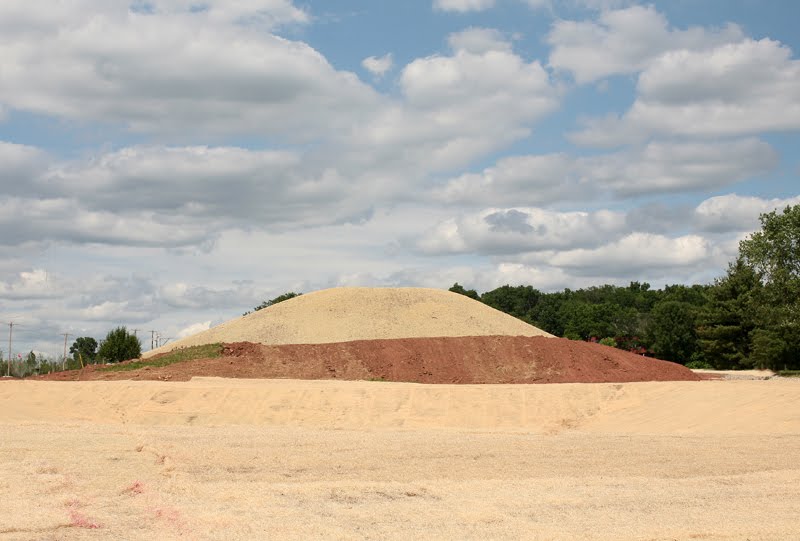
 Mt. Casino 2009
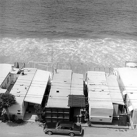

 1
1 2
2 3
3 4
4 5
5


03_web.jpg)


